I've always thought Aberdeen's is prettry dreadful. A set of goals with a football.. pretty childish.

However, the worst I've seen has to be Barnsleys, a cartoon dug FFS
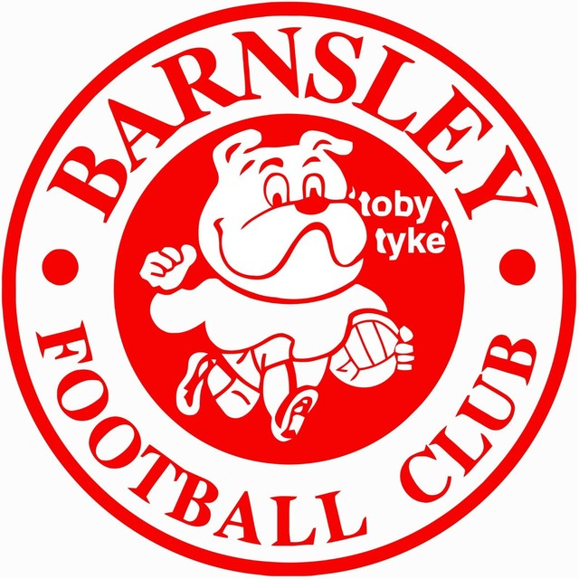
That Barnsley one is awful.
Whats the reason for that RFC thing rather than the official crest? Have often wondered that.
Dundee has a shield and a crest that have both been used over the years. Both make cracking tattoos
That Barnsley one is awful.
Whats the reason for that RFC thing rather than the official crest? Have often wondered that.
I'm not really sure to be honest!
Interesting subject I've never thought of club logos being not very good .
Used to think of them as only club logos .
Think I will have a look at some later today.
The Besiktas logo is pretty cool.

The Roma one is terrible. I would post it but I cannot seem to get it to work
The Roma one is terrible. I would post it but I cannot seem to get it to work

It's a bit minging eh? lol
Never really thought about it to be honest.
Arluno Calcio have a cool badge. From the 8th tier in Italy!

I like Roma and have a lot of time for them.
Worst by far is Millwall:
Arluno Calcio have a cool badge. From the 8th tier in Italy!
Did they buy it in the 2012 fire sale?
The aroma badge looks to me to be signifying Remus and Romulus, the founder of Ancient Rome.
There is a legend that they were suckled and raised by wolves as infants.
Still looks a bit daft.
 Like x 1
View List
Like x 1
View List
 Agree x 1
View List
Agree x 1
View List